Requirements
This program is designed to run on Windows XP SP3 or Vista SP1 systems that have the .NET 2.0 framework installed,
which is freely available from
Microsoft .
Genotyping should be performed using very high density SNP microarrays such as Affymetrix
SNP5 or SNP6 chips. SNP6 data files must be annotated with chromosome and positional data, which
can conveniently be done using SNPAnnotator.
Assumptions
The basic algorithm used by DominantMapper works on four assumptions:
- The disease is a dominant condition.
- All the affected individuals have the same mutation.
- All the carriers are affected and are not mosaic for a new germline mutation.
- If unaffected sib data is included in the analysis the mutation must demonstrate complete penetrance.
Data entry
The data shown in this user guide relates to the pedigree shown in Figure 1, where SNP data is available for the
individuals marked with an asterisk. The family has been shown to contain a dominant mutation in the TSPAN12 gene
at 120 Mb on Chromosome 7. While the pedigree contains a number of nuclear families, SNP data is only available for both parents
in two families (parents 3 - 4, and 11 - 12). The affected children of the other families are not analysed separately as part of a
distinct family, but rather as affected relatives of one of the other families.
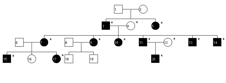
Figure 1
Adding parents
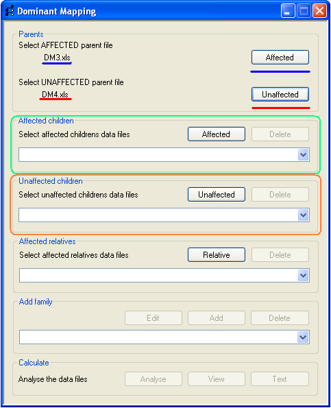
Figure 2
Each family to be analysed is added sequentially and must include both parents, one of whom is affected, and have at least one
affected child. To add the parents, press the appropriate Select button (Figure 2, underlined in blue
for an affected parent and red for the unaffected parent) and select the correct SNP data file.
The name of the file is then displayed by the program (underlined in Figure 2).
Adding children from affected families
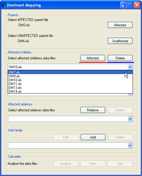
Figure 3
Affected and unaffected children are added using the buttons on the Affected children and
Unaffected children panels (highlighted by green and orange rectangles respectively in
Figure 2). Data for an affected child is added using the Affected
button (underlined in red, Figure 3) and the name of the SNP data file is added to the drop-down list below the button.
To remove a genotype file select its name in the drop-down list and press the Delete button
(underlined in blue in Figure 3). Similarly, the data for unaffected children is added and removed using the appropriate
buttons in the Unaffected children panel.
Adding affected relatives
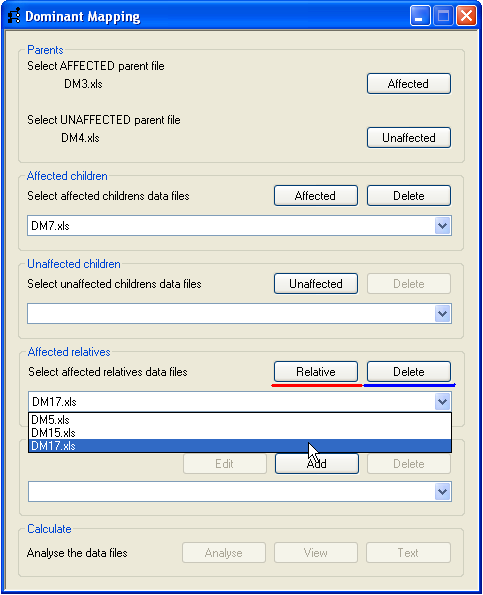
Figure 4
It is possible to include affected individuals who belong to the same pedigree, but whose parent data is incomplete or
absent (e.g. individuals 5, 15 and 17 in Figure 1). These affected relatives are included by pressing the
Relative button on the Affected relatives panel (highlighted by the red line, Figure 4)
and the file name appears in the drop-down list. Selecting a file name in the drop-down list and pressing the
Delete button removes the file.
Adding a family
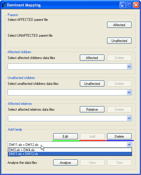
Figure 5
Once the parents, children and affected relatives have been added, the family can be stored by the program by pressing the
Add button (underlined in red, Figure 5) on the Add family panel. The
family name is created by combining the affected and unaffected parents’ file names, and is added to the drop-down list in the
Add family panel. Families can be removed by selecting their family name and pressing the
Delete button (underlined in blue, Figure 5). Pressing the Edit button
(underlined in green, Figure 5) removes the selected family from the drop-down list and re-populates the family data into the
Parents, Affected children, Unaffected children
and Affected relatives panels, from where the family data can be edited and then re-added
to the family drop-down list by pressing the Add button again. Once a family has been added the
process can be repeated for other nuclear families in the pedigree.
Viewing the analysis results
Analysing and viewing the data
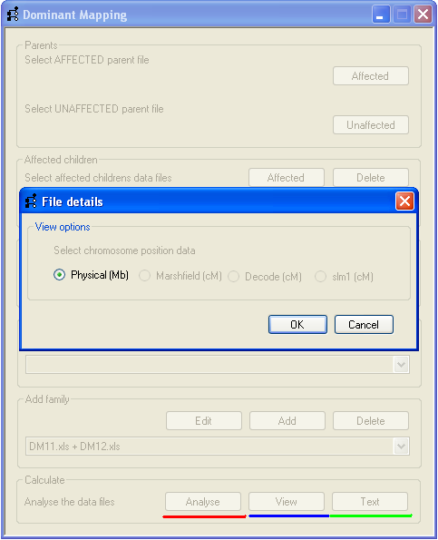
Figure 6
To analyse the SNP genotype data, press the Analyse button (underlined by the red line, Figure 6)
and choose which distance units you wish to use on the File details form. Only those distance units
present in the affected parent’s SNP data file of the first family are available to be selected. In Figure 6 only the
Physical (Mb) option is available, as the file contains no genetic map positions.
Once the mapping units have been selected, the program will load the SNP data and then test each SNP for missing genotypes
(nocalls) and non-Mendelian inheritance. SNPs that fail these tests will be excluded from further analysis. The remaining SNPs
are then tested against a set of rules to identify SNPs that can be excluded from linkage to the disease loci. Once this analysis
is complete the View button (above the blue line in Figure 6) will become active; pressing it will
open a new window displaying the results of the analysis (Figure 7).
The results window displays data for one chromosome at a time, and is composed of two regions which display the analysis results
(Figure 7). The upper region (orange bar to the right of Figure 7) shows the results of the rule-based analysis for each SNP, while
the lower region (black bar to the right of Figure 7) shows a graph of an empirically derived score, plotted against chromosome
position. The chromosomal map position is shown between the two regions; the units are either Mb or cM, according to the unit
selection made at the start of the analysis. The discontinuous thick blue line below the scale represents the positions of the SNPs,
with gaps identifying regions with no SNP coverage.
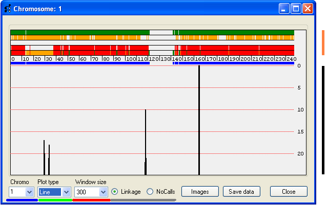
Figure 7
As with SAMPLE, IBDfinder and AutoSNPa, the results
are intended to be assessed visually, and have not undergone statistical analysis. Rather, these programs perform comparisons
of genotypes across large segments of the genome, in order to make inferences about common ancestry of such regions. Since
these chromosomal fragments have undergone relatively few recombinational events, their size is very variable, and not of
itself an indicator of the likelihood of harbouring a disease gene.
Results window – upper region
The upper region is composed of 5 horizontal ribbons on which vertical bars representing SNPs are displayed; the colour of
the bar represents the linkage status of the SNPs as follows:
| Green: |
Uninformative SNPs. |
|---|
| Orange: |
SNPs excluded because an affected relative and an affected child are homozygous for different alleles. |
|---|
| Yellow: |
SNPs excluded because an affected child and unaffected child are homozygous for the same allele, while their affected parent is
heterozygous. |
|---|
| Red: |
SNPs excluded because affected children are homozygous for different alleles. |
|---|
The lowest strip combines all the information for each exclusion criterion, with regions that show an extended run of green markers
being consistent with linkage to the disease gene.
N.B. The data used to create Figure 7 does not contain any unaffected children; consequently there are no yellow markers in
this figure.
Results window – lower region
Due to the limited screen resolution, compared to the large number of SNPs per chromosome, multiple SNPs are likely to occupy the
same pixel on the screen. It is consequently difficult to discern visually whether a region has been excluded by just a few or by many
SNPs. To give an indication of the number of SNPs that exclude a region, the lower region of the display shows a graph of the number
of non-excluding SNPs in a sliding SNP window. The size of this window is set using the Window size
drop-down list box (Figure 7, underlined in red). Since most SNPs are uninformative, the graph only shows regions that have 25 or
fewer excluding SNPs. The horizontal gridlines indicate the number of excluding SNPs in the window, at intervals of 5 excluding SNPs.
Figures 8–10 show the results for Chromosome 7 (which in this family is known to carry a dominant TSPAN12 mutation
located at ~120 Mbp.
By default, this graph is plotted as a line graph, with the points positioned at the centre of each SNP window. However,
since SNP density is not uniform along the chromosome, it is alternatively possible to view the graph as a series of
Tapes or Bars that indicate the extents of the windows (Figures 8B, C).
While the Bars view displays the width of a window, it is possible for regions to overlap, making
them appear to be one wide region. To overcome this, the Tape plot highlights points where regions
overlap. These different plots are selected using the Plot type drop-down menu (underlined in
green in Figure 7).
View options
Below the graph is a series of controls for changing the view options of the two display regions, and for saving the
underlying data. These include the Window size and Plot type
controls described above, while the Chromo listbox (underlined in blue in Figure 7) allows
selection of which used to select which chromosome is displayed. (The current chromosome is also indicated at the left-hand
side of the title bar.) For example, to view Chr. 7, select 7 from the list (Figure 7, blue underlining).
The Window size list controls the display of the plot of the number of non-excluding SNPs in
the lower part of the display. The size of the sliding window can be set to 100, 200, 300 or 400 SNPs; the latter three
settings are illustrated in Figure 9A-C respectively).
Export data
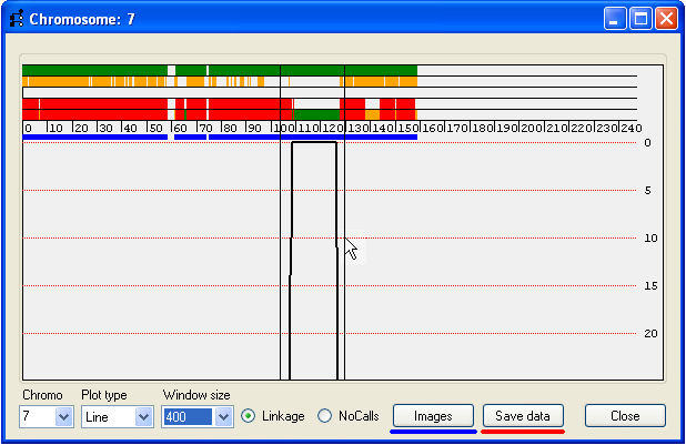
Figure 10
The data underlying a region of interest can be exported either to a colour-coded web page or to a tab-delimited text file.
To select such a region, place the mouse cursor at the start of the region and while holding down the left mouse button, drag
the cursor to the end of the region. The currently selected region will be delimited by two black vertical lines (Figure 10).
To save the data, press Save data (underlined in red, Figure 10) and enter the name of the
output file and filename extension.
It is also possible to create a web page containing the image of the analysis for each of the chromosomes (Figure 11) by
clicking the Images button (underlined in blue in Figure 10).
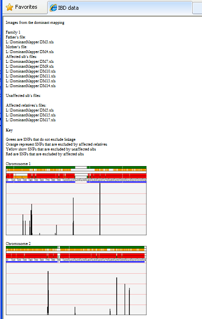
Figure 11